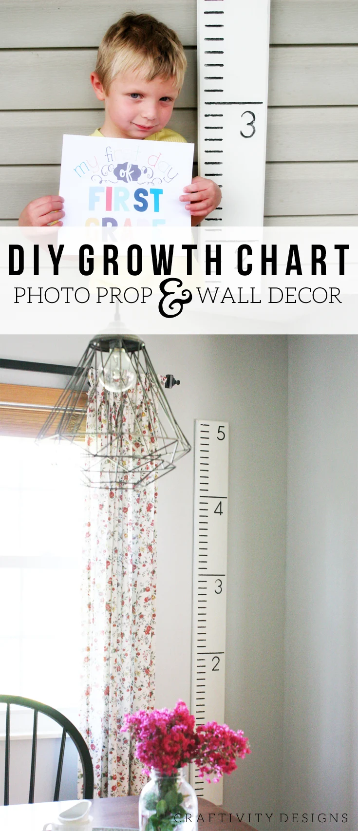
This Growth Chart Photo Prop isn’t a groundbreaking tutorial, but I hope sharing my experience will answer a few questions about how to make one of these for your own family.
**Amazon Affiliate links are included in this post.
We brought home an unfinished wooden Growth Chart last Thanksgiving. It was a Black Friday deal… and insanely cheap. Well, I guess you get what you pay for; because it’s not true to size and measurement. It would be more aptly named an “approximate growth” chart.
[Tweet “How to make a Growth Chart for your family – by @CraftivityD”]
This growth chart, which is handmade by Half Pint Ink Studio, however, is intended to be an accurate growth chart {what an idea, right?!}.
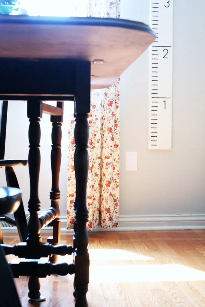
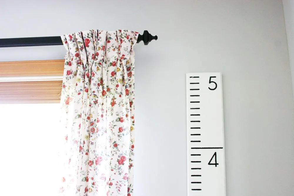
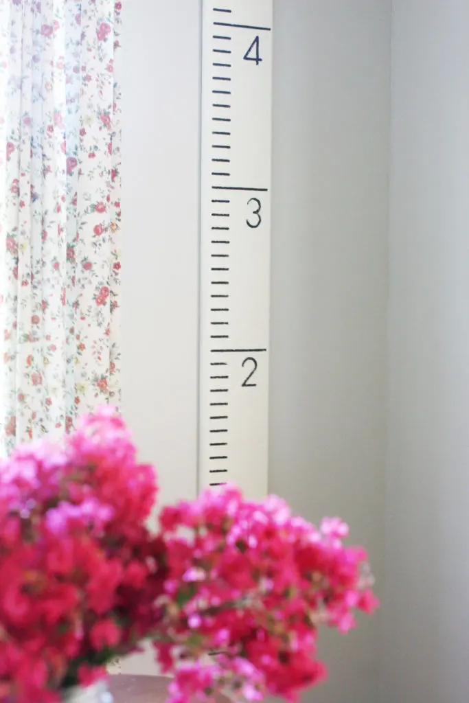
Half Pint Ink Studio has even designed the growth chart for the fact that you won’t want to hang it directly at the floor level. If you hung it at floor level, it would interfere with your baseboard trim. This is part of the reason our growth chart is hanging much higher in the Breakfast Nook. It couldn’t be hung true-to-height, so I just chose the most desirable location on the wall, instead.
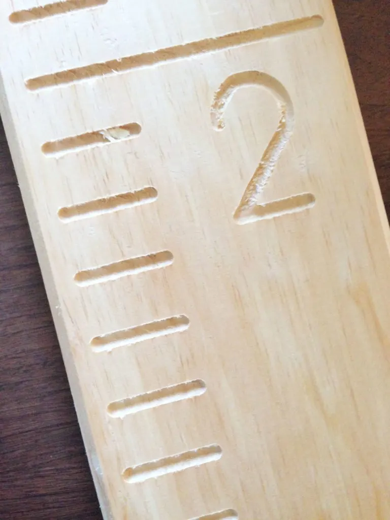
I hadn’t tackled this project, until recently, partly due to feeling stumped over how to paint the routed numbers and hash marks. Essentially, there were three options that I could come up with:
- Paint the entire growth chart a solid color, then add the detail afterward with a contrasting color.
- Paint the details with a contrasting color, then paint the solid color without pressing the brush into the routed details.
- Paint the entire growth chart a solid color, then add the detail afterward with a contrasting color using a permanent marker or paint marker.
Granted, options #1 and #3 sounded easy, but I was concerned it would be difficult to keep the numbers and hash marks from looking messy. Maybe if you are talented with a paint brush, it would be the simpler choice. That, however, is not me.
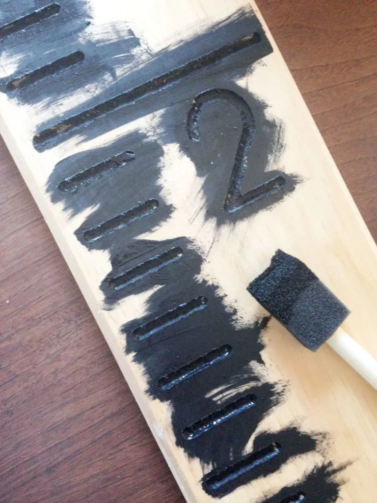
So, I went with option #2. I used a black paint to fully color all of the detail areas and didn’t worry about staying within the lines. My goal was full coverage, not perfection.
Next, I painted over the black with white paint. I was careful not to press my brush into the numbers and hash marks. In order to really cover up the black, it required several coats of paint. A primer in between the black and white paint would probably have been a better choice.
There were some touch-ups required afterward — where the white paint got into the routed areas — but, overall, it resulted in the clean look that I had envisioned.
[Tweet “The perfect #BacktoSchool photo prop – a Growth Chart – by @CraftivityD”]
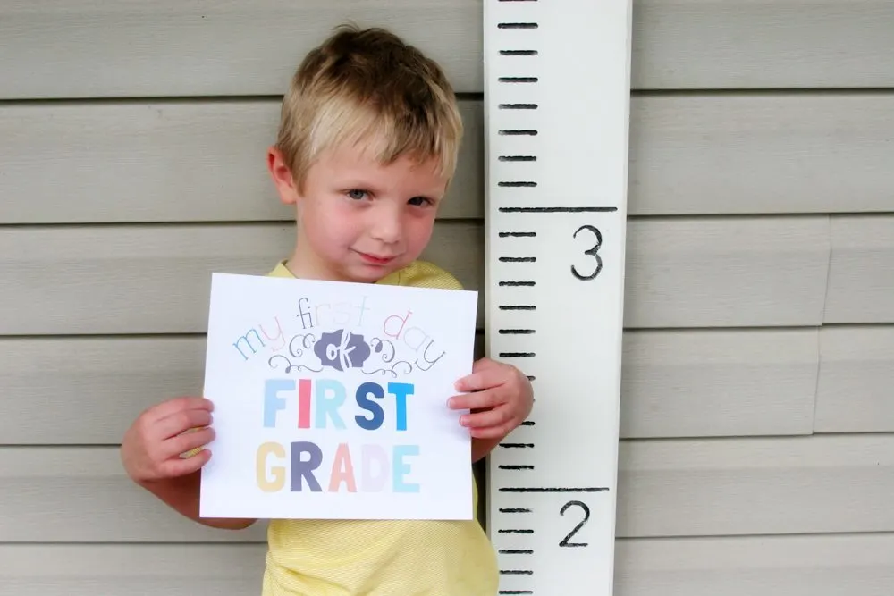
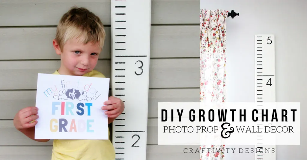
It’s part of the decor in our Breakfast Nook, but we’ll also be using it as a Photo Prop.
Yes, it’s already time to start planning for Back to School. Summer went so fast… but doesn’t it always?
Ya’ll know I’m all about anything that is multi-purpose. So, this growth chart + wall decor + photo prop is a “bang for it’s buck” type of project.
Are you interested in the First Day of School Printable? Find out more here.
Sharing at Remodelaholic.

Susannah
Friday 12th of August 2016
This is so adorable! I'm inspired to make one now... Let's see if I actually do it! ;-)
craftivitydesigns@gmail.com
Saturday 13th of August 2016
Thanks, Susannah! I know how that goes :) so many ideas, so little time!
Sarah @ Making Joy and Pretty Things
Saturday 30th of July 2016
I am in love with this growth chart!! Such a good idea to not have it directly on the floor. Your son is such a cutie!!
craftivitydesigns@gmail.com
Tuesday 9th of August 2016
He's a cutie -- and a total ham, lol.
Colette @ restyle it wright
Saturday 30th of July 2016
awwww I miss my kids being little! This is a sweet back to school pic idea! Also seriously funny that it wasn't accurate!
craftivitydesigns@gmail.com
Tuesday 9th of August 2016
I know? So bizarre.
alina
Friday 29th of July 2016
I like the idea! I've taken a lot of pictures with Oliver when he was little and still do but I don't keep track of how old he was at that point, I am thinking to do something similar to this. Funny how the size was not accurate :)) it's a size chart at the end of the day..
craftivitydesigns@gmail.com
Friday 29th of July 2016
I know, so weird, right!?
zan
Friday 29th of July 2016
How funny that the size was not too accurate. But it really turned out well and I love you found multiple uses for it. It is amazing how one little project can stump our progress. At first, I imagined that paint option #1 & 3 would be easier, too but I see the logic behind #2. I looks perfect - like you bought it already painted!!
craftivitydesigns@gmail.com
Friday 29th of July 2016
Thanks! He is a cutie -- not that I'm biased, lol!
zan
Friday 29th of July 2016
Forgot to add that your little son is way too cute!!