Back in the days before I blogged…
I decorated a room for a very special little boy.
But, we didn’t know he’d be a boy. When we found out I was pregnant, we chose to keep the gender a surprise, which meant creating a space that a little boy, or a little girl, would love.
Disclosure: This page includes affiliate links.
It’s possible that you may have seen some photos of my little boy’s nursery before, over on Emily’s blog. I was beyond excited to see his sweet space in blog-land 🙂 and I love both Emily’s design style and her writing style, so it was a huge honor to be on her site. In fact, if it weren’t for reading and being inspired by her blog the last 3.5 years, who knows if I would have ever started DIYing and blogging in the first place.
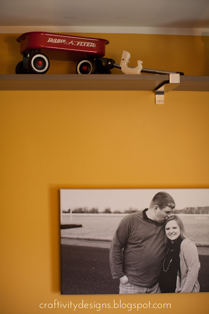
Mike and I got the inspiration for this room from some vintage toys I’d collected over time. I just love the look of the time-worn, faded primary colors. Since we didn’t know whether we’d be having a boy or a girl, using a mix of primary colors seemed to be a great solution for a gender neutral space.
We chose a warm, mustard-y yellow for the walls. I love this yellow and would use it again in a heartbeat. It’s not too golden and not too sunshine-y. Just a muted, warm yellow.
His dresser {which also serves as the changing table} is the 8 Drawer Hemnes from IKEA in gray-brown. A sweet lady from our church gave us a set of colorful ceramic knobs which were the perfect replacement for the basic pewter hardware that came with the dresser. We purchased shelves in the same gray-brown finish to wrap around the room about 1ft. below the ceiling. In order to avoid getting too matchy-matchy, the crib is deep navy but still has simple lines like the dresser.
Over the dresser are alphabet cards from Pretty Little Studio hung with tiny clothespins on red pom-pom trim.
However, once our little guy got a little bit bigger he wanted to play with the flash cards, so he’s “re-decroated” a bit. Can you spot the difference in this current photo of his nursery?
A few less letters in that alphabet right now. I just stick them away for safe keeping as he pulls them down. They’ll either go back up in that spot or get moved to the playroom as he starts to learn his alphabet.
As I mentioned when I shared our covered patio cushions, my mom is a fantastic seamstress, and she helped with so many details in her grandson’s nursery. We picked out a collection of vintage-inspired fabrics and she worked her sewing magic — creating everything from the window treatments to his quilt.
Mike found the perfect mobile for above the crib. They are actually Christmas ornaments from a local boutique, Two Chicks and Co, here in Lexington {yes, there we go again, using holiday items in our year-round decor}. The scale is amazing for the space but they are very lightweight, formed out of paper mache and covered in printed paper. I love how the gallery walls peaks out from just behind them.
The gallery wall is a mix of handmade art, special mementos and thrifted items. A few months ago, I shared how I created a gallery wall in our entryway; and I plan to share a little more about this gallery wall in a future post.
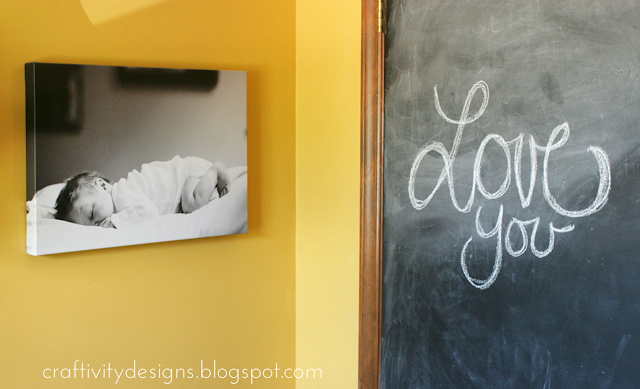
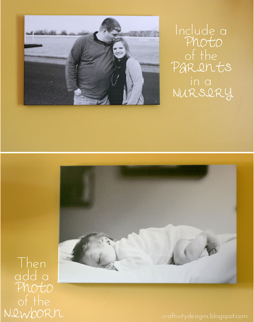
For the remaining walls in the nursery, we chose much simpler decor to keep the room from feeling over-stimulating. I’m not always crazy about having giant pictures of myself in our home, but I love this canvas of Mike and I while we were still expecting our little one. To create this wall art, I ordered a simple black and white 16″x20″ size print from Canvas on Demand. After he was born, we placed his newborn photo on the opposite wall.
Not far from his newborn print is the closet door which we covered in chalkboard paint. It’s our little boy’s favorite spot in the room.

Yeah, that photo is awesome. I don’t know how I ended up getting that angle exactly, but it’s just one of the best photos ever, in my humble #notsohumble opinion.
Speaking of photos, my brother took most of these {including the ones that I got printed on canvas for the nursery}. He’s a Professional Photographer in Louisville and a pretty great Uncle too! Go check out his site.
So there you have it — a gender neutral nursery — perfect for our newborn boy and still great for the little 2.5 year old that he is now {goodness it’s hard to believe it’s been that long since that newborn photo}. We’re so glad we kept his gender a surprise and this fun little nursery is all because of that unknown!


How to Update a Collage Frame – Craftivity Designs
Monday 19th of April 2021
[…] good example is my son’s photo that was in the entryway of our last home. However, in the nursery I chose B&W for the large photos since there were so many other colors in the room — I […]
Craftivity Designs
Wednesday 2nd of October 2013
Hi, Rachel! The color is Safari Sun by Valspar, 3004-5B is the code.
Rachel
Friday 27th of September 2013
Hello, I have been searching high and low for paint color for my meditation room. I came across your blog and this is exactly the color I've been searching for. Could you please tell what's the name of the color you used? thanks so much.
Craftivity Designs
Monday 22nd of July 2013
Thanks, Danielle! I love his little space. It just makes me happy :)
Danielle
Monday 22nd of July 2013
Lora, what a sweet nursery. I love the mustard walls and the vintage toys. The portraits are gorgeous. Thanks for sharing at Silver Pennies Sundays. x