I’ve pinned many a room in which a homeowner has decorated a small, unexpected spot.
 |
|
| wall art tucked into the corner, beside a bookcase // via BHG |
I just love these little surprises.
 |
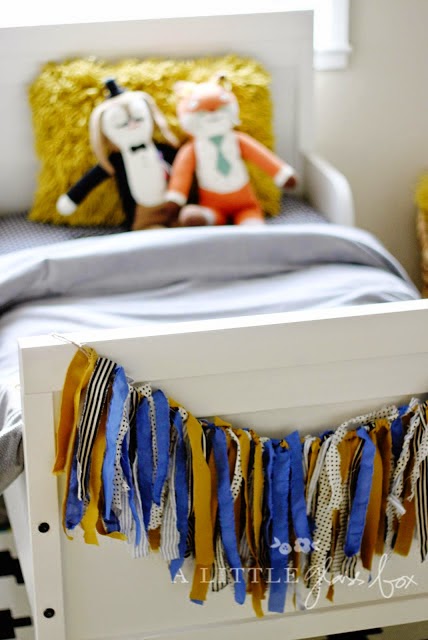
| garland hung at the foot of a child’s bed frame // via A Little Glass Box |
A simple, unique detail, that catches your eye.
 |
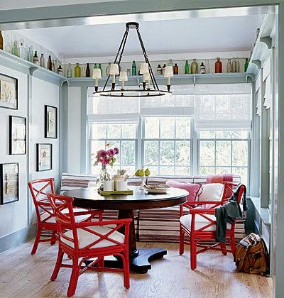
| glass bottles stored along the ceiling of a dining room // original source unknown |
It does take looking at your space from a different angle. So often we decorate looking straight-on… facing the biggest wall, the main piece of furniture or the focal point.
 |
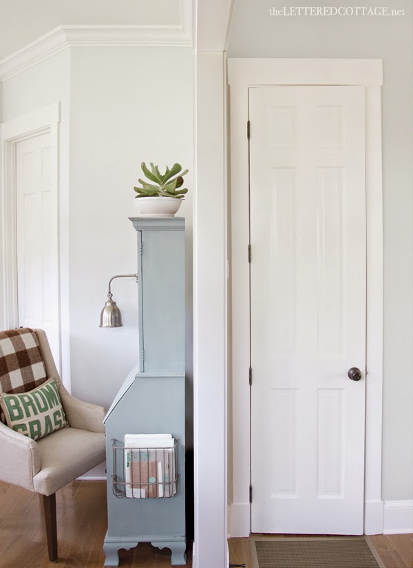
| storage on the side of a secretary desk // via The Lettered Cottage |
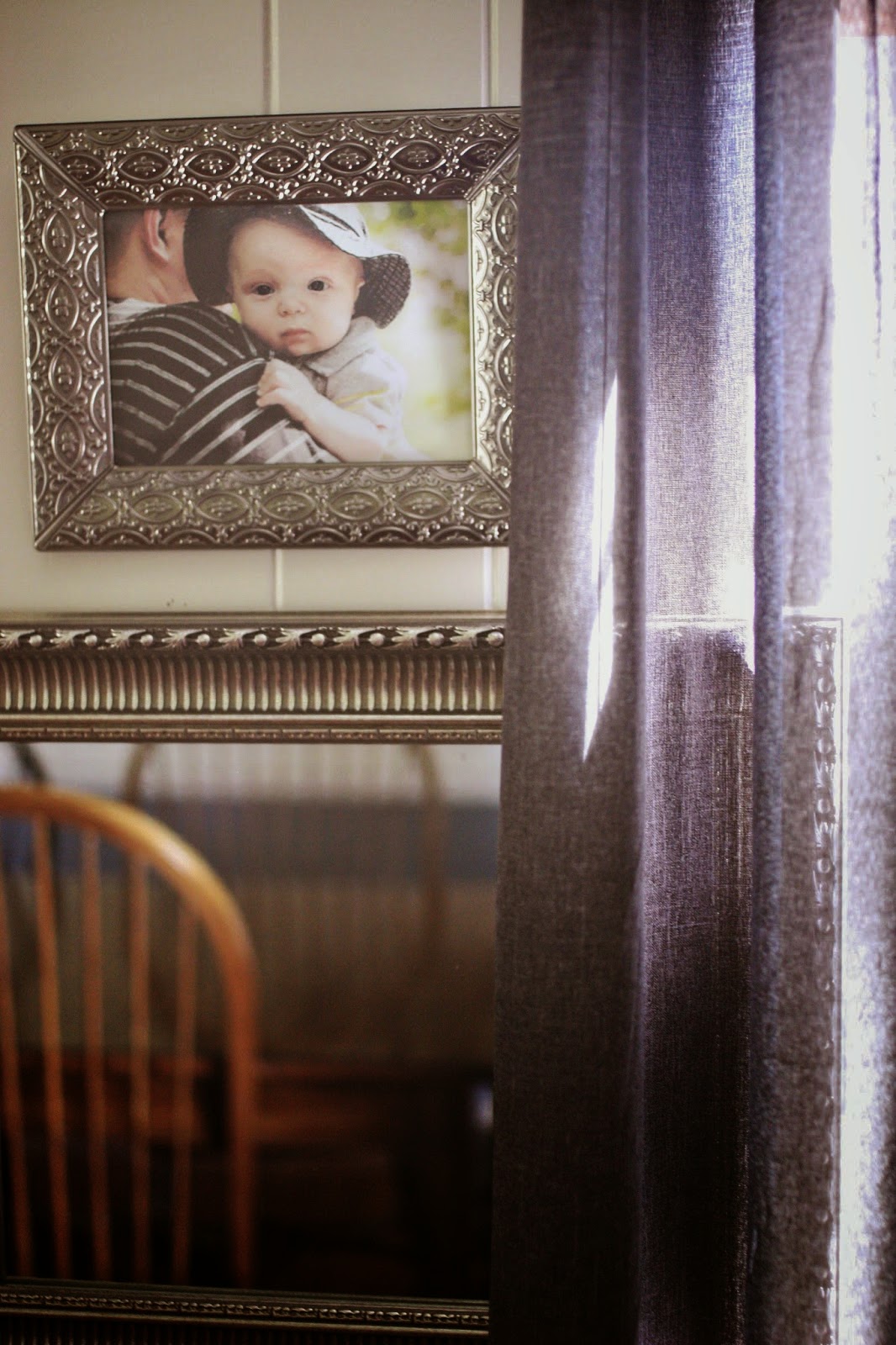
I’ve tried to introduce this technique in my own home. We have art hanging in a window…
 |
| coffee bar |
… and peaking out from behind curtains, for example.
 |
| dining room |
I’ve been working on my son’s bedroom and just realized, today, that it has one of those spots. I installed some book ledges several weeks ago and love them {sorry, that’s an IG pic, haven’t got a post on the blog yet!}. However, after standing at his closet, I realized there was an opportunity to decorate one of those “forgotten” spots.
It’s a small nook between the entrance to his room and the closet. Thus far, it included the light-switch and the remote for the ceiling fan… so aesthetically pleasing 🙂
But a few pieces of art {some from the pages of a cute little book} transform the little corner into something special, and unexpected.
The switch and fan remote start to fade away, too, once they are surrounded by this small art gallery. Now, for fun, here is the side by side view!
I’m quite pleased with this simple update to an otherwise “forgotten” spot in our home.
What little nook, corner or unexpected spot could you update in your home?


Craftivity Designs
Monday 2nd of February 2015
Thanks :)
Christie Selken
Monday 2nd of February 2015
Your gallery wall looks great! Thanks for sharing at Totally Terrific Tuesday! I hope you stop by tonight at 10pm to link up your recent posts!
Craftivity Designs
Monday 26th of January 2015
That is cute! Then it becomes 'art' too :)
TwoPlusCute
Monday 26th of January 2015
I love how you placed frames around the light switch! Looking at the photos, I got an idea for the light switch. I can't draw it here but try to imagine: a frame around it, the switch all the way to the right, and a vertical pic or saying(like "on-off") to the left of the switch (still inside the frame), so both pic/saying and switch appear as embedded inside the frame.Thanks for the inspiration. :D